
Your kitchen cabinets set the tone for your entire cooking space. Their color and style impact how the room looks, feels, and functions. As we enter 2024, it’s time to take a fresh look at your cabinet colors and ensure they align with the latest trends. Before you hire a kitchen and bath contractor, read on as we explore the cabinet hues that will make your kitchen shine this year and beyond.
Neutrals Are Still In
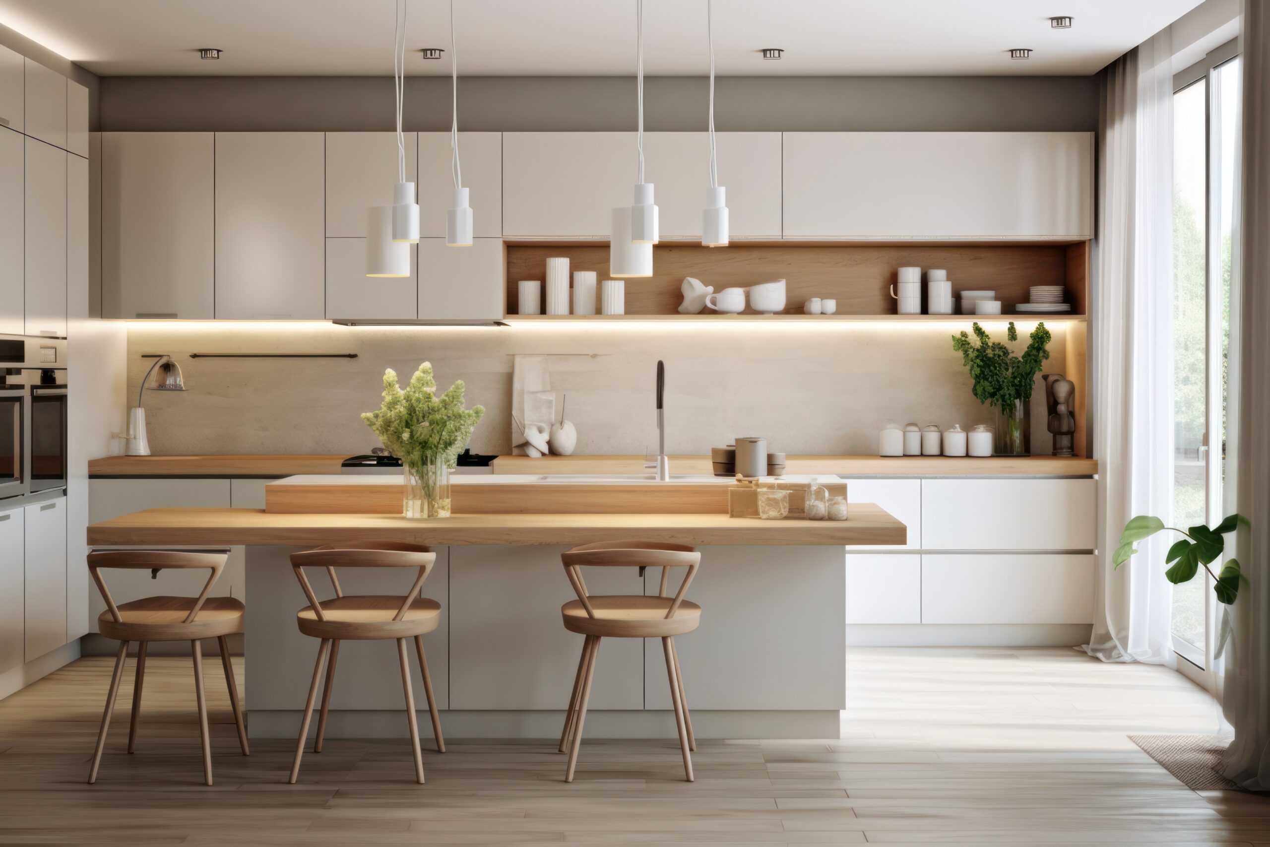
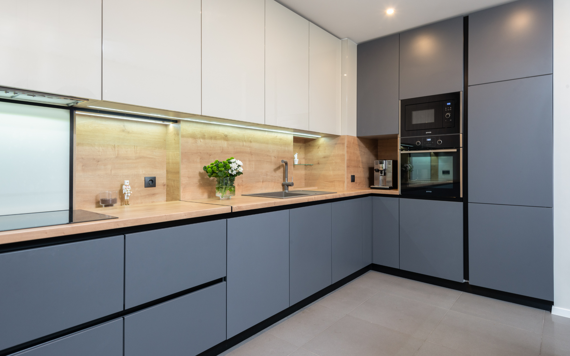
Neutral cabinet colors like white, cream, gray, and beige remain sought-after options for many homeowners. These muted, soft colors create a clean and airy look in the kitchen.
The Appeal of White
White kitchen cabinets is a top choice for those seeking a minimalist, modern aesthetic. The crisp, bright white color provides a fresh, open feel. The versatility of white cabinetry also makes it easy to integrate pops of color through accessories and decor without clashing.
White kitchen cabinets offer a blank canvas to build your dream kitchen around. They work with any style, from modern to farmhouse. White cabinets also make small kitchens appear larger and brighter.
For true white lovers, opt for a flat white paint rather than a creamy eggshell or ivory. This bright white provides maximum luminosity. However, some prefer an off-white with just a hint of warmth.
Off-White Options
Off-whites are a subtle alternative to stark white. Soft shades like almond, biscuit, and mushroom add a warm, creamy undertone without being too beige. These off-white cabinets still read as neutral while introducing a touch of personality.
Popular off-white kitchen cabinet color options include:
- Almond – A pale tan shade with golden undertones. Provides a subtle warmth.
- Biscuit – A soft beige-tinged white. Warm without going too creamy.
- Mushroom – A versatile, warm grayish beige. Modern yet natural.
- Chantilly Lace – A pretty off-white with hints of ivory and peach. Timeless and traditional.
- Cotton White – True white with a barely detectable gray undertone. Crisp but not sterile.
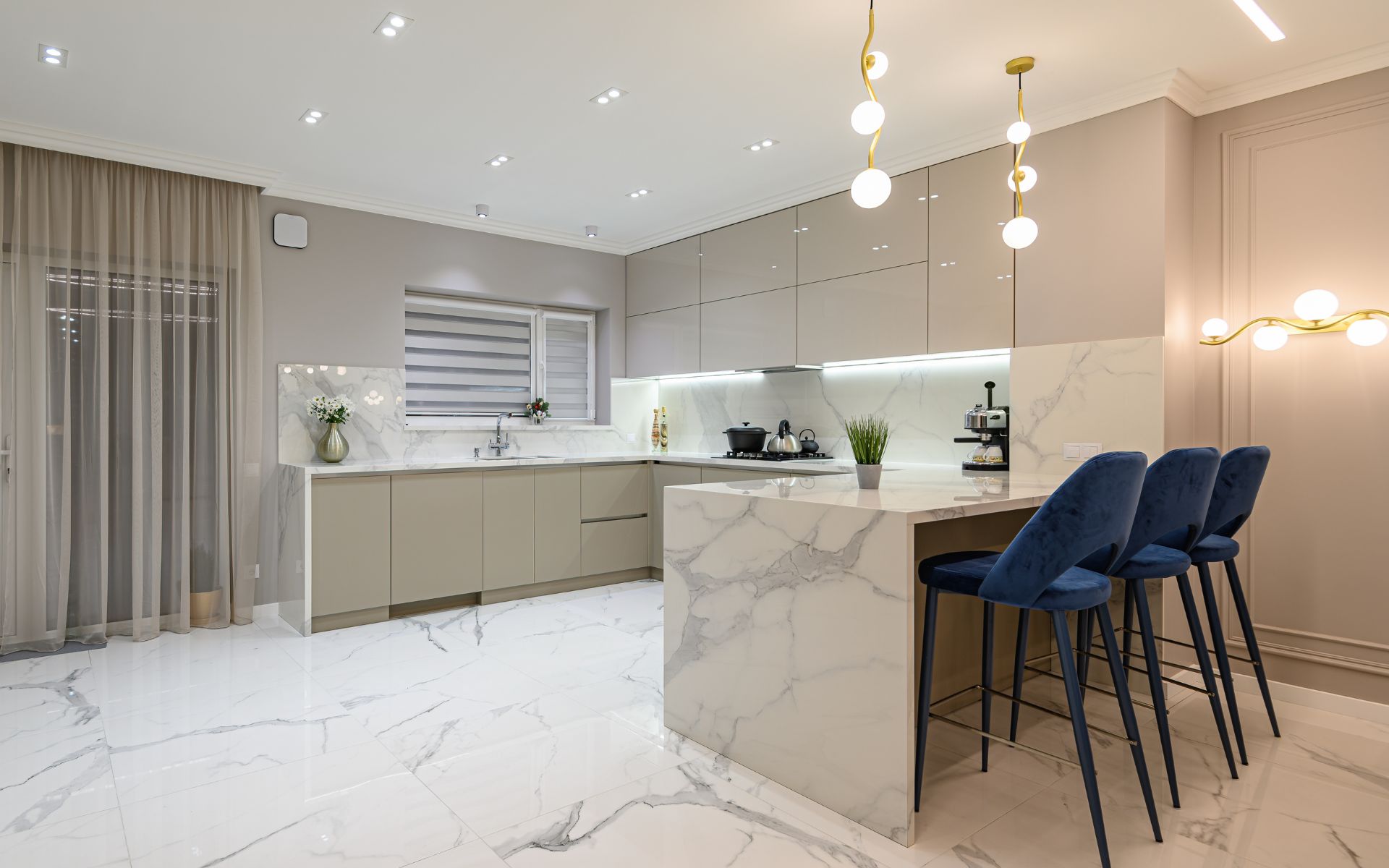
Grays and Beiges
For those seeking something a bit bolder than plain white, soft beiges and warm grays are popular neutral shades that add more visual interest. These muted neutrals work well in both modern and traditional kitchen designs.
Gentle grays, especially those with beige or taupe undertones, provide an alternative to stark white that is still versatile enough for any style. The soft gray gives a very subtle moody effect while still feeling bright and airy.
Popular gray shades for kitchen cabinets include:
- Light pewter – Has a hint of blue that counteracts the yellow of oak.
- Warm greige – A blend of gray and beige that’s both modern and natural.
- Charcoal – A bold dark gray that contrasts nicely with lighter counters.
- Wolf Gray – A warm medium-toned gray with earthy brown undertones.
For beige cabinet colors, options like almond, biscuit, and mushroom offer light neutrals with a hint of creaminess. Fawn and camel are slightly bolder beiges that add an earthy vintage vibe.
When choosing a gray or beige, it helps to sample large paint swatches right in your kitchen to observe how the undertones pick up the light throughout the day.
Vibrant Jewel Tones
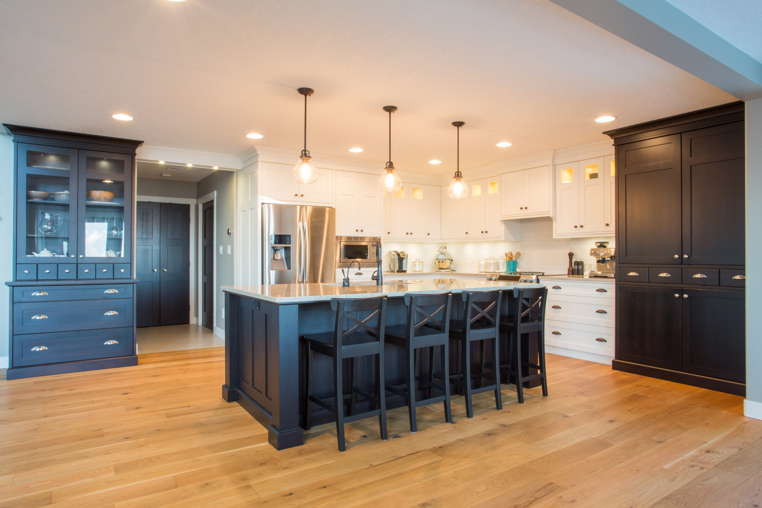
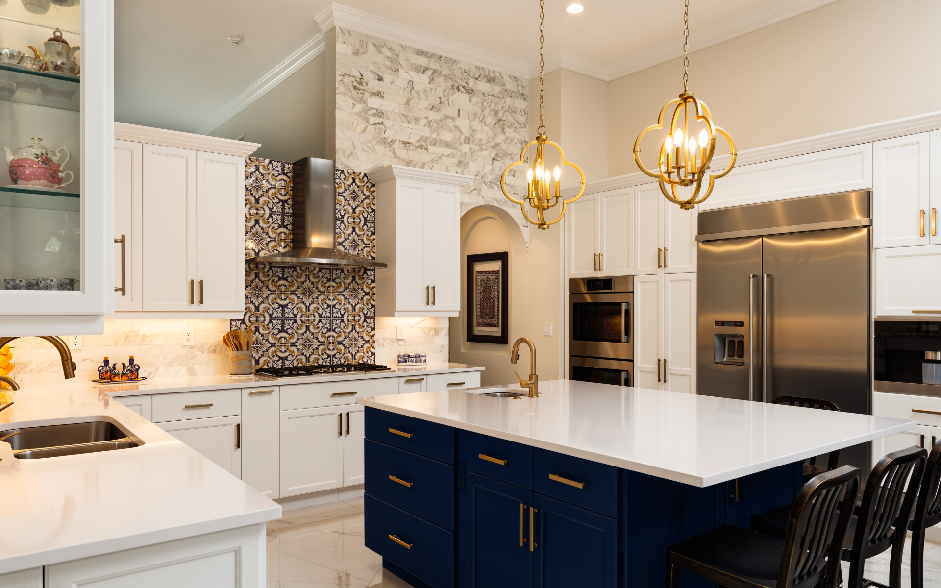
While neutral cabinets are safe and versatile, bold jewel tones are an emerging trend for adding drama to the kitchen. Deep blues, greens, and purples are regaining popularity for kitchen cabinets and make quite a style statement.
Research by paint brand Behr shows that navy blue and other rich blues are rising in popularity for kitchen cabinets and other paint colors this year.
Invigorating Blues
Navy and sapphire blue cabinets are making a splash in contemporary kitchens. The deep midnight colors create an almost regal elegance.
Lighter tones like powder blue can also impart serenity, evoking the blue skies and seas. Robin’s egg blue has a retro 1950s vibe. Adding blue to the kitchen balances stimulating warm tones like red and orange.
To balance bold blues, stick to lowers or islands in the deep hues and pair with bright white uppers. Or use blue on the uppers and balance with warm wood-stained lowers.
Matching brass hardware and fixtures will also complement the blue elegantly. Blues also pair well with marble, granite, and quartz countertops or tile backsplashes.
Vibrant Greens
Emerald and jade green cabinets bring an organic, earthy vibe through the saturation of the jewel tones. Sage greens offer the same refreshing essence in a lighter soft hue.
Deep green cabinets provide a bold yet inviting look. The color evokes nature, renewal, and wellness. Open up a small dark kitchen with vibrant lime green lowers.
Pair emerald cabinets with unlacquered brass or antique copper hardware and lighting for a cohesive palette. Granite, butcher block, or wood countertops also complement the earthiness of green cabinets.
Plums and Purples
Plum and eggplant purple cabinets introduce an air of regal elegance with a modern twist. The deep, saturated purple tones lend a sense of luxury and drama. Lighter lavender or lilac cabinets keep the femininity while reading as more neutral. The 2023 Pantone Color of the Year, Viva Magenta, reinforces the trend of using bold jewel tones like purple in home interiors.
Use dark purple only on the lower or an accent island so it doesn’t overwhelm you. Metallics like pewter pair well with purple’s jewel tones, along with glass tile or quartz counters. For a playful accent, add a pink glass vase or light fixture.
Pastels For a Soft Look
On the opposite end of the color spectrum, soft pastel cabinets are also gaining renewed interest. Minty greens, sky blues, and pale pinks create a gentle, ethereal look in the kitchen. These muted hues keep the space feeling light and airy. This is one of the most popular kitchen cabinet ideas in the color department.
Pastel cabinets work well for evoking vintage charm in cottage, farmhouse, or shabby chic kitchen designs. Pairing pastel lowers with bright white uppers helps maintain the luminosity so the space doesn’t look washed out.
Sweet and Subtle Minty Greens
Mint green in all shades from pastel to seafoam has a fresh, invigorating effect. These cool greenish hues add vibrant color without overwhelming small spaces. Mint green reads as neutral enough for small doses on lower cabinets or islands.
Avoid going too bright or neon with mint green. Soft seafoam or pistachio works best for a soothing palette. Pair with white uppers and light wood flooring to keep things feeling breezy and light.
Cheerful Sky Blues
Powder blue cabinets evoke thoughts of sunny skies and fluffy clouds. The ethereal, soft blue is cheery but not overpowering. Mix different shades of blue for a custom look. Use blue judiciously in small kitchens as it can make walls seem to recede. White uppers and light counters help bounce light around. Add windows and skylights if possible to complement the airy blue tones.
Barely-There Pale Pink
For a romantic, feminine touch, barely-there pink cabinets work well. Stick to soft rose, petal, or carnation pinks rather than neon for a subtle effect.
Pair the palest pink lowers with white uppers and marble subway tiles. Brass hardware also complements the delicate pink beautifully. Just take care the overall palette doesn’t get too saccharine.
For those who find pastels too sweet, opt for peachy neutrals like almond, biscuit, or mushroom instead of true pinks or mints. These provide a subtle warmth without overwhelming the space.
Create a Cohesive Color Palette
Whatever cabinet colors you choose, remember to consider the overall color palette and decor of the kitchen. Mixing and matching colors in a disjointed way can make the space look choppy. Try to choose accent colors that coordinate well.
For example:
- Blue cabinets would pair nicely with metal accents in brushed nickel or oil-rubbed bronze.
- Green cabinets could be complemented by copper or bronze metal finishes.
- White cabinets provide the flexibility to incorporate any colors through decor, textiles, and accessories.
Think about how your cabinet color complements:
- Countertops – White, beige, and gray marbles offer continuity. Granite, soapstone, and butcher block provide contrast.
- Backsplash tile – Match cabinet color for cohesion or contrast for interest.
- Flooring – Light wood, tile, or vinyl helps keep things airy.
- Hardware and fixtures – Nickel and chrome metallics match cool tones, while brass and bronze mirror warm hues.
- Window treatments – White is flexible. Colored shades can tie into cabinet hues.
- Accessories – Tie your accent pieces like rugs, art, and appliances into the cabinet colors.
Achieving harmony between your cabinet color and the rest of the kitchen elements results in a polished, pulled-together space.
Factors To Consider When Choosing Colors
Beyond just aesthetics, also factor in practical elements when selecting cabinet hues. Consider:
- Lighting – Darker colors show more flaws. Opt for lighter cabinets in low-light kitchens.
- Kitchen size – Bold colors can overwhelm a small space. Neutrals maximize the feeling of openness.
- Natural light – Cool tones like blue and green work best in sunny rooms. Warm cabinets are cozy and welcoming in darker kitchens.
- Your cooking style – Busy cooks may avoid high-maintenance white. Minimalist cooks embrace the clean palette.
- House style – Contemporary and modern homes suit bold colors. Traditional homes tend towards classic white and wood.
- Resale value – Neutral, light cabinets appeal to the widest range of buyers if you plan to sell your home.
Eco-Friendly Cabinet Options
For the ultimate eco-friendly kitchen, choose sustainably produced cabinetry made from recycled, non-toxic materials. Options include:
- Recycled metal cabinets from scrap iron, copper, and tin
- Bamboo cabinets for a renewable option
- Recycled glass cabinets to display dishware
- Salvaged antique cabinets give new life to old materials
- FSC-certified wood from responsibly managed forests
- Cabinets made with water-based finishes for reduced VOCs
The American Society of Interior Designers predicts that sustainable, eco-friendly kitchen cabinet materials like bamboo and recycled wood composites will become more mainstream.
Wrap-Up
Kitchen cabinet colors make a major impact on the aesthetic of your cooking space. When planning a kitchen update, carefully consider cabinet colors that will coordinate well with your existing elements or the new design features.
Neutral white, cream, and gray remain fail-safe options with versatile appeal. Vibrant jewel tones inject drama and sophistication. Soft pastels create a delicate, ethereal look. Just remember to factor in the size and style of your kitchen when selecting a color palette. With strategic cabinet color choices, you can create a kitchen that is both functional and beautiful for years to come.,